Design
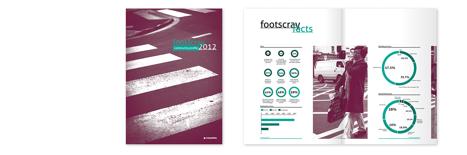
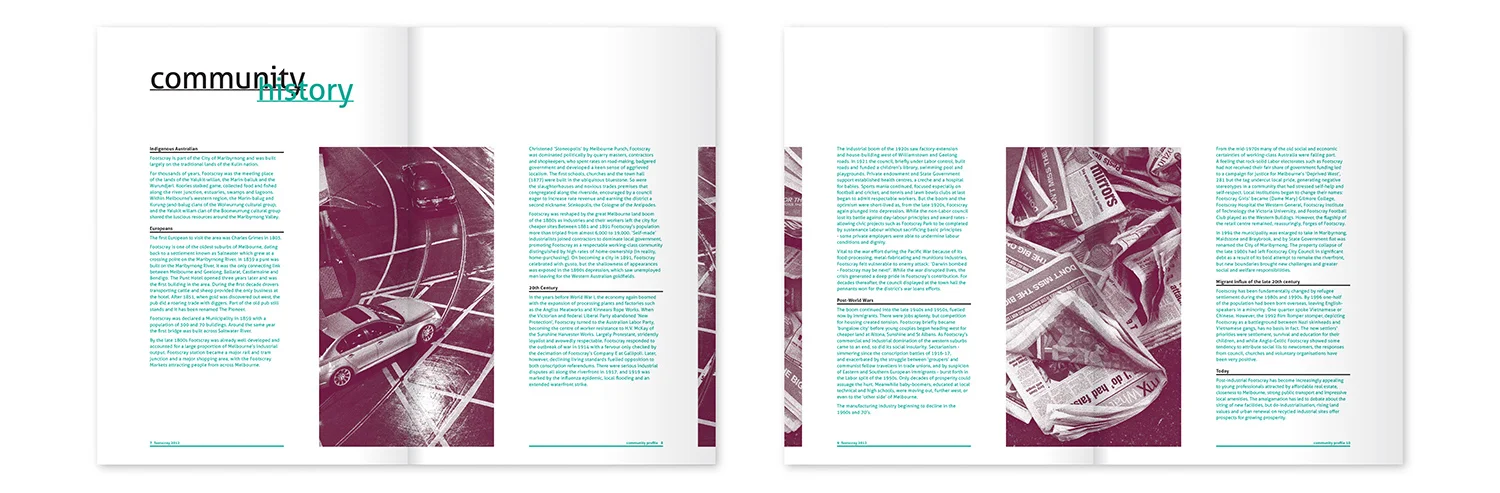
Community report - The brief for a Community Profile called for a clear, easy to read report in a modern, clean and edgy style. Most importantly, the report stands apart from typical council reports. (Student work)
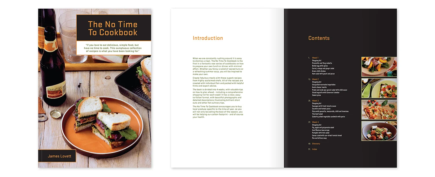
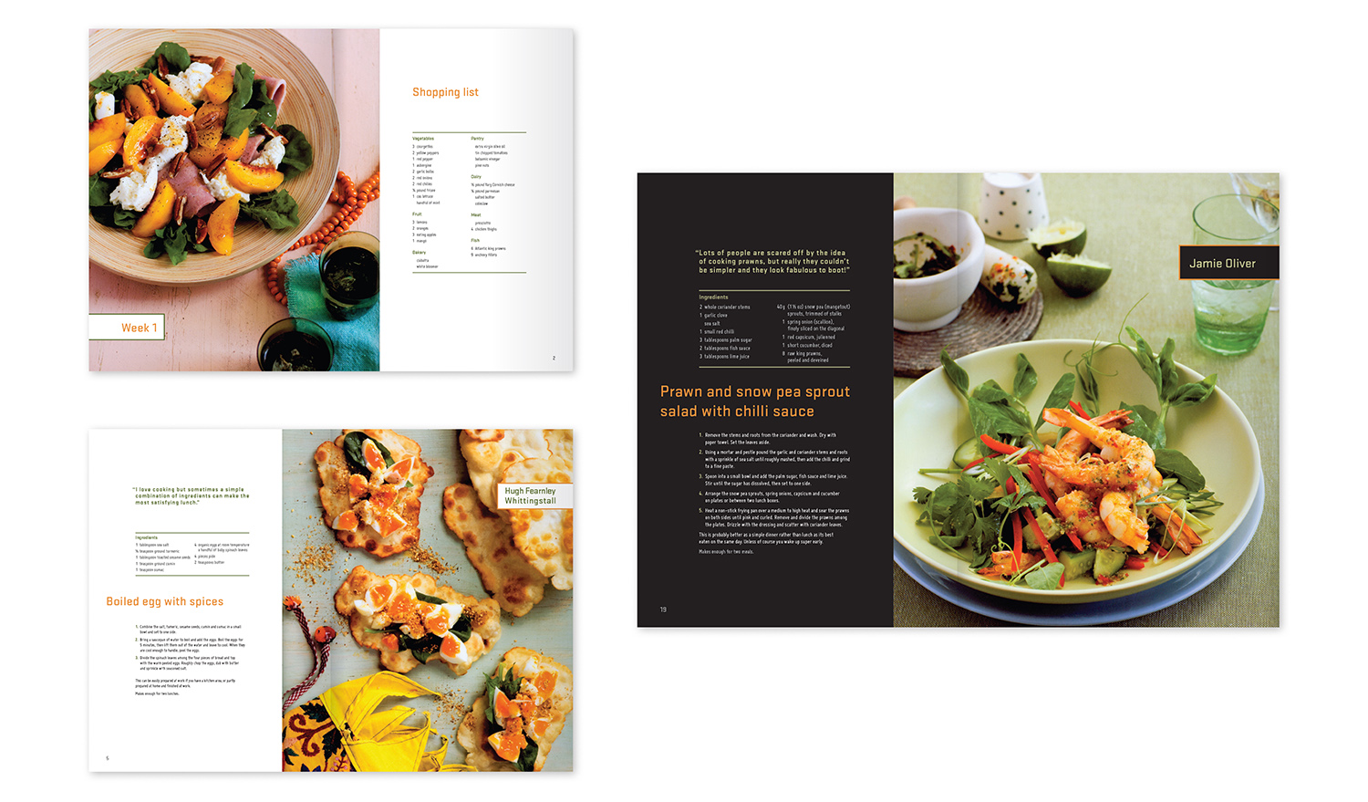
No Time To Cookbook - The cookbook is aimed at young professionals who love food but don't have much time to prepare their meals. It required a contemporary feel, without being too feminine or conservative. The cookbook is clear and easy to use with bold use of photography. (Student work)
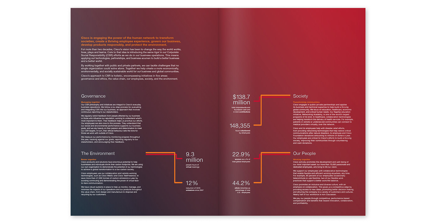
Corporate Report - The Cisco Corporate Social Responsibility highlights report was designed with a strong, clean, contemporary look. The graphic elements represent Cisco’s aim of shaping the future of the internet and finding new ways to bring people together. (Student work)

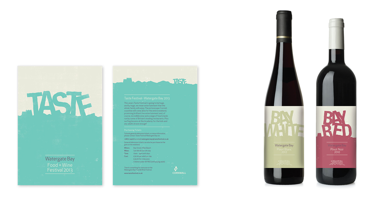
Food & wine festival flyer and collateral - The Watergate Bay Taste festival in North Cornwall showcases the region's quality produce and is aimed at chefs, winemakers, producers and local and London families. The flyer and branding look different to the standard food and wine festival collateral and feature a fresh colour palette and simple graphics, without photography. (Student work)
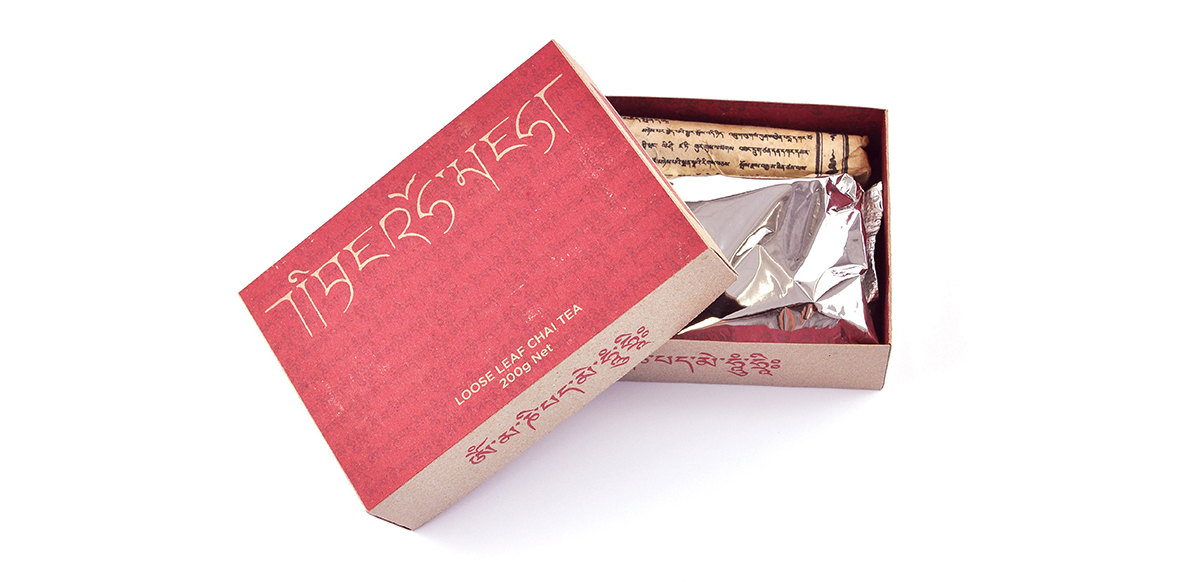
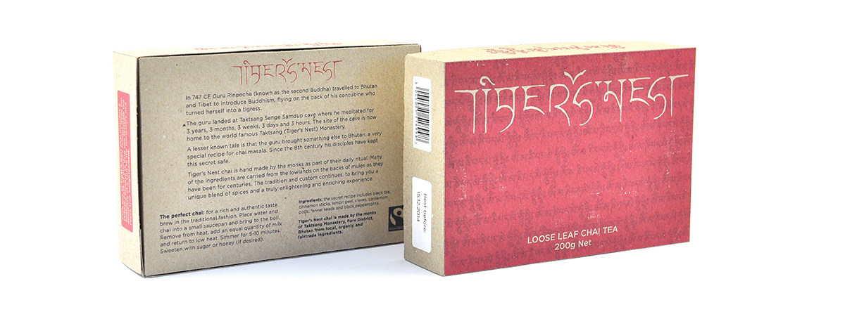
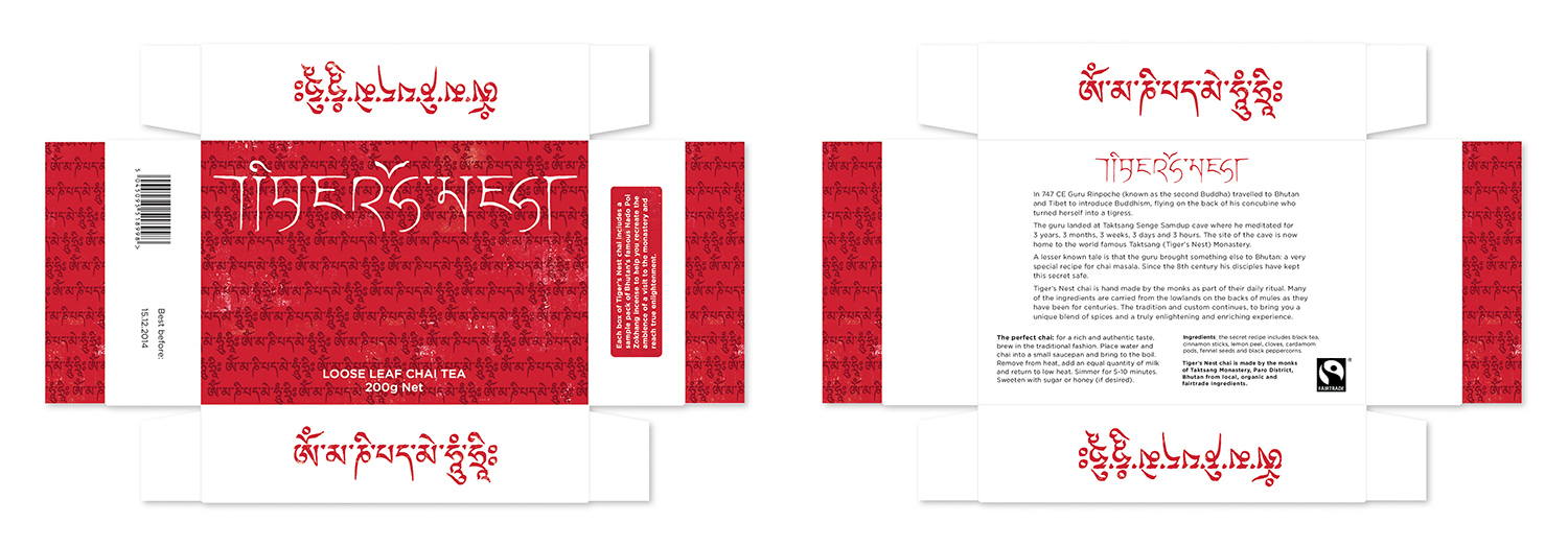
Branding and packaging - Tiger’s Nest chai, inspired by a visit to Taktsang Monastery in Bhutan, is a (fictional) chai tea blend hand made by the monastery’s Buddhist monks. The brand typeface is based on Tibetan/Bhutanese Sanskrit. Each box of chai comes with a sample pack of Bhutan’s most famous incense to recreate the ambience of the monastery. (Student work)

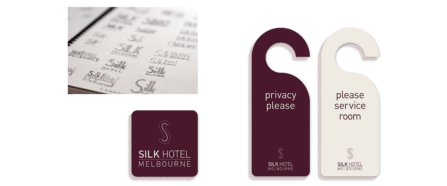
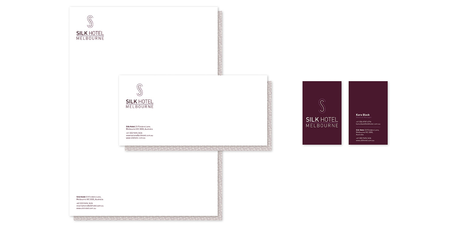
Small business branding and collateral - The brief was to create branding for a boutique designer hotel. The hotel is modern, luxurious and comfortable. The hotel branding reflects the building's history and architecture as a silk warehouse. (Student work)
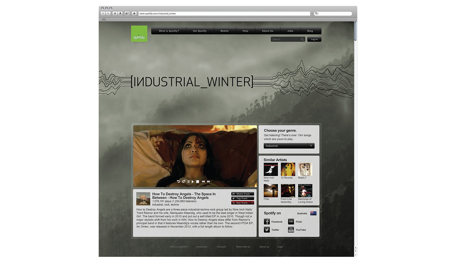
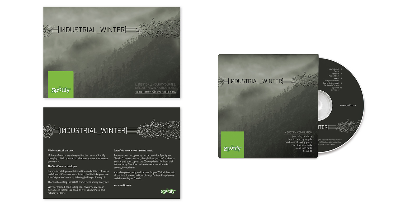
Music website skin and collateral - The brief was to design a site skin for Spotify based on a genre of music, in this case 'industrial'. The design reflects the style of music and aims to attract the demographic that listens to it. This design used one of my own photographs. (Student work)
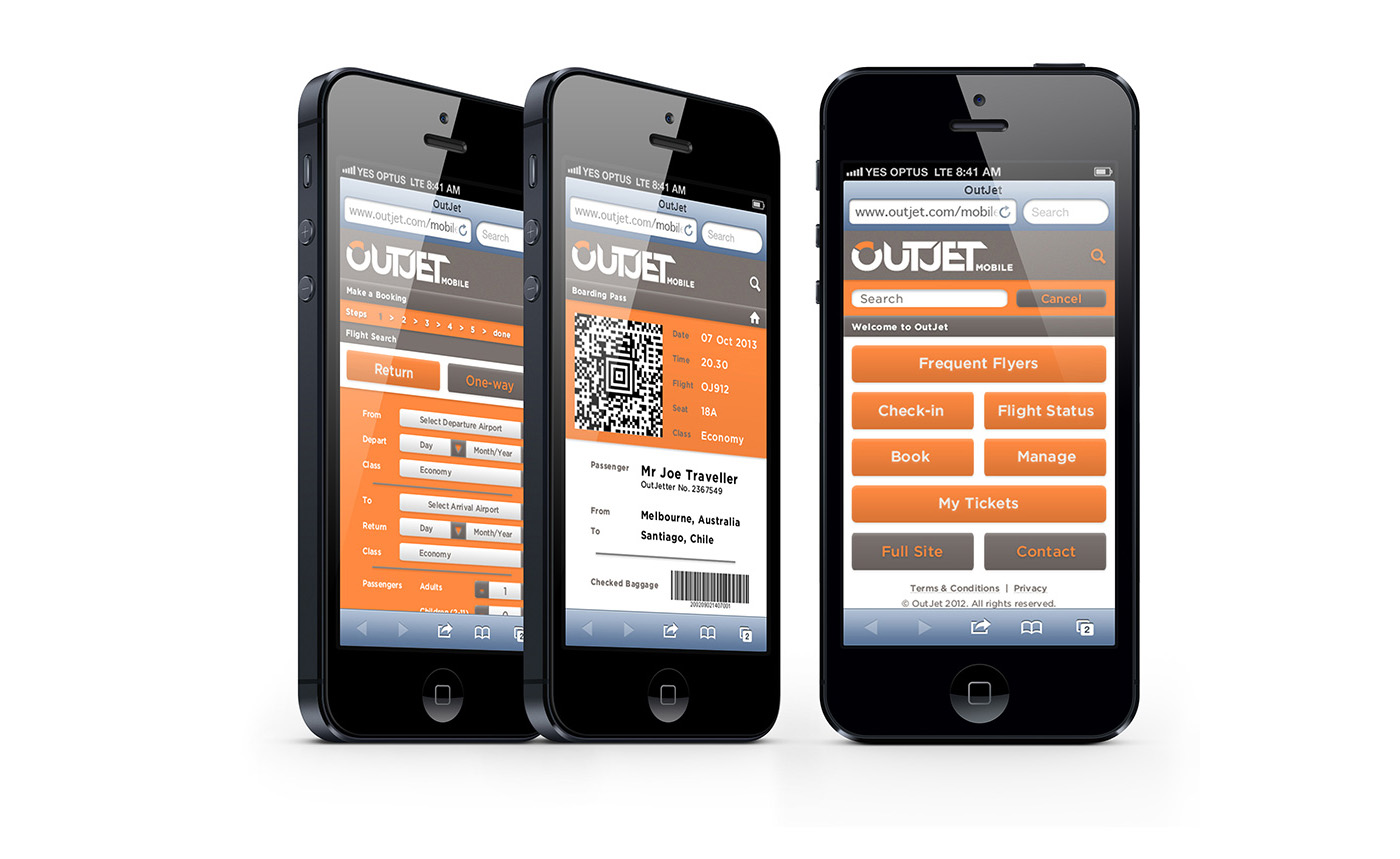
Airline branding and mobile website - The brief was to develop branding for an Emirates budget airline. The airline offers a stylish experience and modern convenience at a low price. The name, OutJet, was inspired by the idea of outperforming their competitors. (Student work)
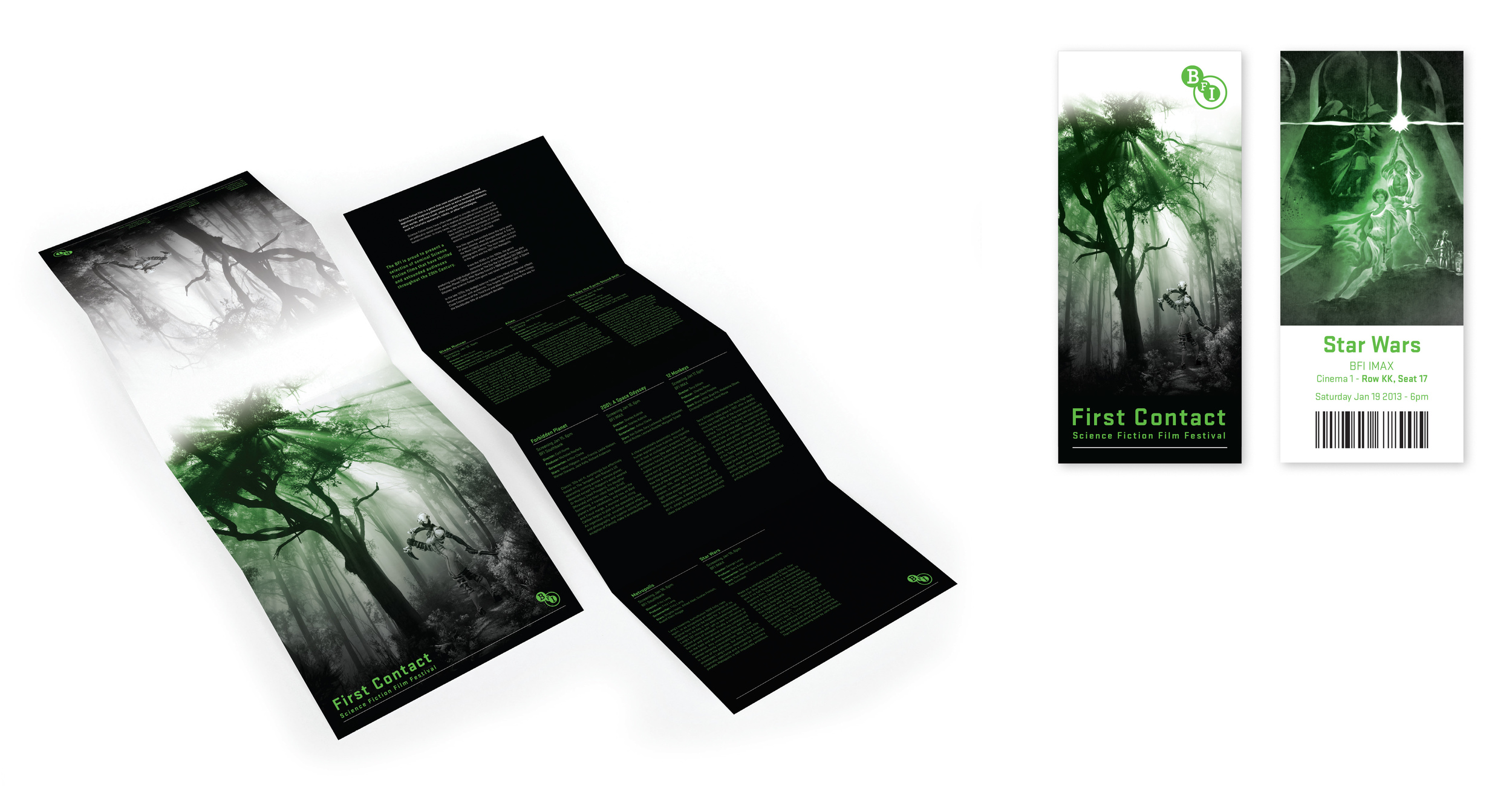
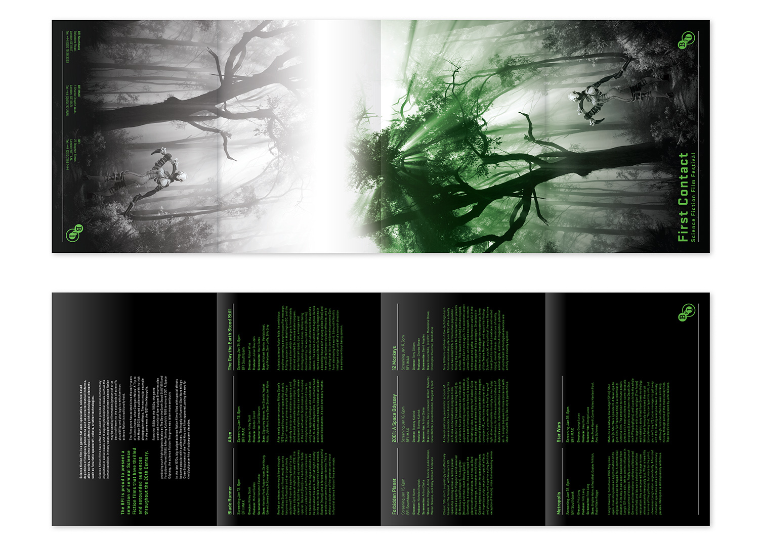
Film festival brochure and tickets - The Science Fiction Film Festival brochure was designed using handmade elements, including my own photography and a hand painted miniature figure. The arrival of alien invaders represented in the imagery gives the festival its name: First Contact. (Student work)
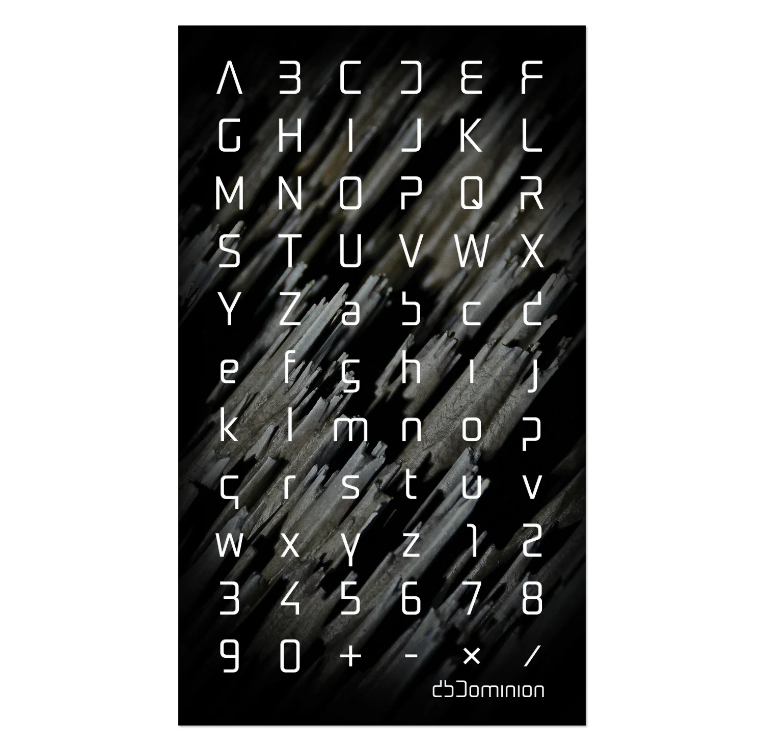
Personal branding typeface - This typeface was developed for use in my personal branding. I started with the standard Stratum typeface and modified by removing sections of letters while maintaining legibility and changing the shape of the rounded lowercase letters. A unique and uniform look has been created by mirroring of letter shapes wherever possible.